A warm welcome to all of the new followers of my crazy blog! I’ve had some time on my hands and noticed that some of you started following my blog after specific types of posts. Since my creativity can be a bit…um…diverse, yeah, that’s a good word for it, from day to day, I decided to create a little logo pic at the top of each post. It’s a lot easier and quicker to see than the category, and it lets you see at a glance if it’s the information you’re interested in. I’m hoping you’ll check out the others, but know that reading time can be short and valuable, so if you’re specifically interested in a topic, hopefully these will help you!
Expect a few changes to them along the way, most likely, because I’m me and can’t leave things alone. *laugh* Plus, if I find a glitter version of something, I’ll jump on that new icon or background immediately. 🙂
I will have a specific logo with a category name at the top. If it works for the guest bloggers, we’ll also use the font and icon from the general category for their own contribution logo, as well, at the end. That’s a concept we’re still playing with. I can promise there will be “This recipe post contributed by…” with a little icon will be at the end of each guest post. I want them to get the credit due to them and it allows for some extra creativity in the post format.
If any followers find these changes annoying, difficult with your browser, or you even have input on what might be a better version, please don’t hesitate to leave your input. It’s just an idea I’m trying out to hopefully help streamline and improve the experience for some of the readers. 🙂
Although I have some that are still far from being decided (I have 10 versions of one, that I narrowed down from probably 25, so it’ll take me just a bit longer and help from others to pick a few of these themes, but I wanted to share a few with you. Some will be a clear background that just blends into the website theme, depending on your viewer/device platform, while some will have white or colored backgrounds, so those will look like a regular ole picture at the top with the category theme. Please let me know in comments if you have a preference, if you have time.
Without further delay, a few teasers (meaning there’s a good chance they’ll change within the next 36 hours lol)…
I’m still really torn on what type of icon I’d like for that theme.
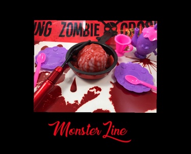
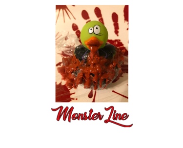
I couldn’t resist using my two favorite monster-themed products for the icons for when I discuss the Monster Line!
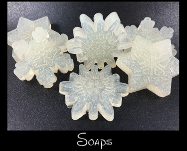
These are an 85% probability of getting used. I obviously will work on getting them all a bit more uniform in size, but I’m just trying to get the basics down for now.